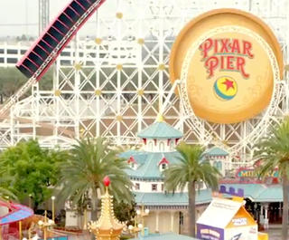
They say the difference between something good and something great is in the detail. Painstaking, carefully crafted, sometimes barely discernible at first glance – the small details are often the things that thrill us the most once discovered. So it comes as no surprise that the “most magical place on earth”, Walt Disney World Resort, is full of tiny details that many people devote time to uncovering and documenting.
Many have heard about and hunted for the ‘Hidden Mickeys’ – thousands of tiny nods to the mouse that started it all. These little silhouettes are hidden in carpets, fabrics, artwork, lights, gardens, or even, as one cast member pointed out to me, specific moments in rides.
For some the highlight at Walt Disney World Resort lies in those little interactions where Cast Members are so genuinely invested in their characters and the happiness of guests – Alice comments on a floral skirt about how she was once called a ‘weed’ by some rather nasty flowers, or in another realm a cashier pretends something is amiss with the transaction, only to tell you it says on the receipt that you ought to buy him candy. Disney have truly nailed the customer experience.
While these are all integral to the detail-oriented experience at Walt Disney World Resort, as a Graphic Designer perhaps the greatest joy is realising the elements designed especially to blend in, those selected to create the immersive, inconceivable world that is Disney.
Accommodation
You’d be forgiven for believing that this renowned attention to detail would be reserved for the parks; however, with over 25 resorts on site, Walt Disney World Resort is a veritable treasure trove of hidden wonders, each more interesting than the last. There are simple details in hotels, such as the characters laid in the marble floors of Disney’s Grand Floridian Resort & Spa, or the region-correct architecture that can be seen in places like Disney’s Caribbean Beach Resort or Yacht Club Resort, but the most remarkable detailing is to be found at the themed resorts.
Staying at Disney’s Animal Kingdom's Villas - ‘Jambo House’, the smallest of things are considered. Driving in, you’re greeted immediately with lights designed to resemble tiny teepee campfires. Entering the main building you find yourself in a cavernous room lined with a grass-thatched roof, rails and poles that look like sticks and branches lashed together with rope, huge light-fittings made of stretched and painted hides, and rope bridges connecting the wings.
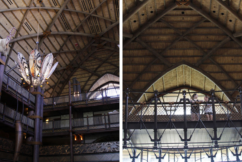
Not stopping there of course, the halls are lined with African-inspired prints and light fittings, the rooms are fitted with beautiful carved furniture, mosquito nets adorn the beds, and the bathrooms are complete with custom Disney safari-inspired wallpaper. That’s not to forget one of the biggest drawcards of this resort – the 30 species of African wildlife that live on the savannah surrounding it, with a wildlife spotting guide waiting in your room.
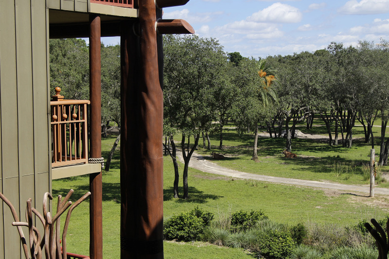 The resort also plays home to 30 different African animal species
 Even the wallpaper in the rooms hides cleverly integrated detaililng
It’s worth visiting the ever-popular Disney’s Art of Animation Resort, which is broken into four main wings based on the popular films The Little Mermaid, Cars, Finding Nemo and The Lion King. As an avid illustrator, when I was younger I aspired to one day work for Disney-Pixar, so entering a resort dedicated not only to the finished films but the conceptual work behind them was incredible.
The wonder starts in the lobby, which has a huge focus on concept art – large simple sketches lining the length of one of the lobby walls, beautiful full colour paintings denoting the entrance to the resort's onsite store (aptly called “Ink and Paint”), light fittings made of smaller drawings fixed from the ceiling, and wonderful, immersive landscapes that feature on the restaurant walls. But that's just the beginning. For Disney’s Art of Animation Resort, the true magic starts once you make your way outside.
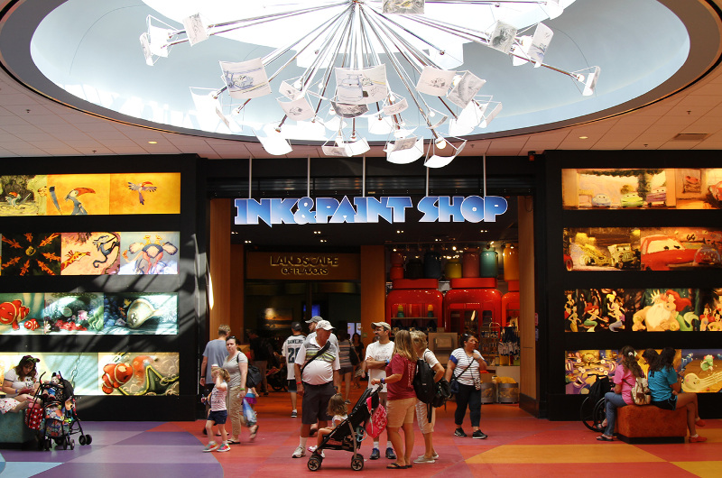 Disney's Art of Animation showcases Disney imagination from sketch to to beautiful, full colour paintings
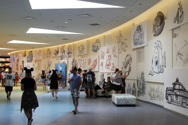 It's the perfect place to see just how Disney brings their animations to life
Each wing features your favourite characters from the films, which provide endless photo opportunities; however, it goes further than that. Plants are carefully selected to resemble the habitats from the films – wonky 'underwater-looking' palms, dry grasses that look like they’d be right at home on Route 66, and endless tropical plants from an exotic African jungle.
The huge pool within the Finding Nemo wing plays music underwater, while seagulls perch atop staircases resembling Jetty’s. Travel down Route 66 to the Cars wing and you’ll find yourself entering the Cosy Cone Motel pool, complete with cone cabanas. Rooms here are fitted with couches modelled off the backseat of a Hudson Hornet; Radiator Springs postcards sit on the bedside tables; and lampshades are fashioned out of traffic cones.
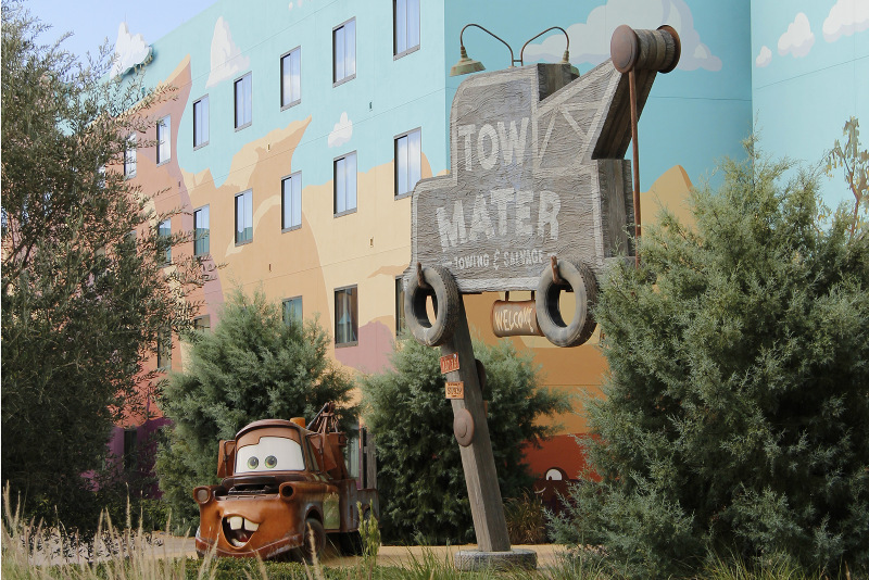 Disney's Art of Animation Resort features different 'wings' themed from Disney movies, including Cars
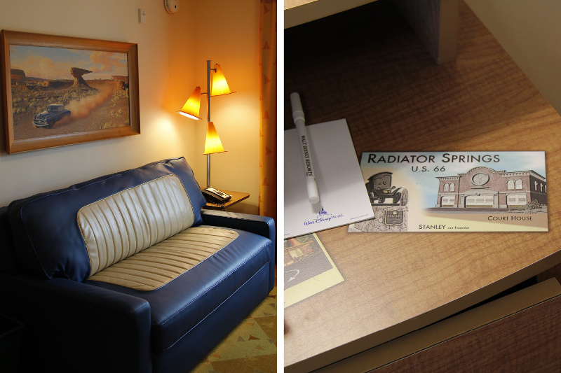 Even the rooms feature impeccable themed detailing
 Cars is a favourite of mine, so to see small things like this in the rooms thrilled the fangirl within me, as well as the attention-driven designer. There are so many wonderful details that it’s hard to summarise the feeling you get while in Disney’s Art of Animation Resort, but it’s safe to say there’s nothing else like it.
Parks
So much love and ingenuity has been put into the Disney parks that it’s hard to pick favourite details, but there are places where the layers of storytelling are so thick you feel you've been transported to a fantasy realm.
Disney’s Animal Kingdom Theme Park is divided into several distinct areas, but there are two (Africa and Asia) that really come to mind when thinking about the energy Disney puts into its seamless experience.
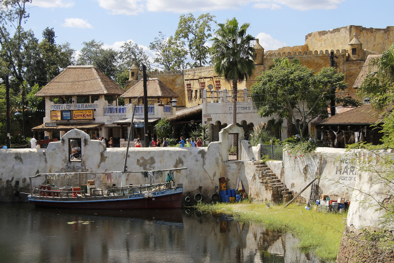 The parks carry out themes down to the smallest detail, seemingly transporting guests to a different world
Seemingly ‘plain’ sections – just walls that connect restaurants or stores – are filled with small imperfections: signage and signwriting that looks as though it’s lived there for decades; light fittings that have a distinct cultural look and bikes covered in bananas or foreign bottles of coke. Even the electrical and phone wiring is haphazard and perfectly imperfect.
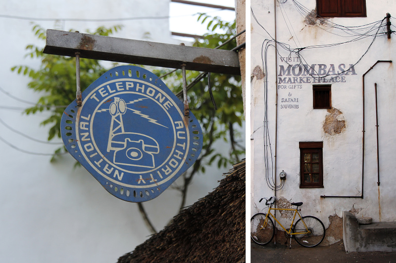 Right down to the signs hanging off of buildings, everything is designed to feel both charming and authentic
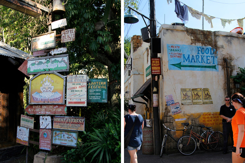 It's astounding the attention to detail found throughout the parks
If you take a closer look at the signage, you’ll see those small but permanent posters speak of other attractions in the park, whether they be thrills and rides, delicious food at restaurants or wares on offer at stores. Typos denote language barriers, and imperfections in execution show signs of humanity. Seeing such beautiful examples of poster design and hand-drawn typography featured ensures that you leave satisfied creatively as well.
Journey on over to Disney’s Hollywood Studios and it’s a different experience altogether. The story here is not one of exotic countries but of a golden era in American history and the people, architecture and culture that went with it. It’s starts from the entrance, where the stroller, wheelchair and mobility scooter pickup is a 1930s gas station. Cast members push water carts disguised as lighting grips.
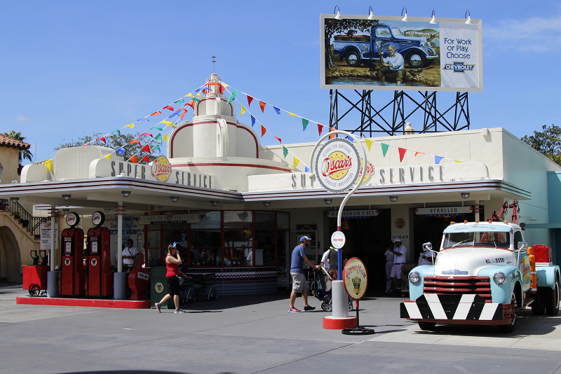 There are different architectural styles found throughout that hearken back to the worlds your favourite characters lived in
As a huge fan of Art Deco design in all its geometric beauty, it was amazing to walk the streets in awe of the beautiful facades. Follow these boulevards to the The Twilight Zone Tower of Terror and you’ll find yourself within a 5-star lobby, uninhabited for decades, littered with stunning genuine antiques. Or venture toward Star WarsTM Star Tours - The Adventures Continue and find yourself dwarfed by giant AT-AT walkers and surrounded by Storm Troopers.
The most entertaining is Pixar Place, complete with the iconic gates modelled from the entrance to their California studios right down to the type and colour of brick. The main ride here is Toy Story Mania!, and it’s evident the moment you pass through the gates. It's like stepping into the movie itself complete with interconnected ‘Barrel O Monkeys’ hanging overhead, little green army men lowering scrabble board signage from the tops of the buildings, and posters in Paddle Pop stick frames.
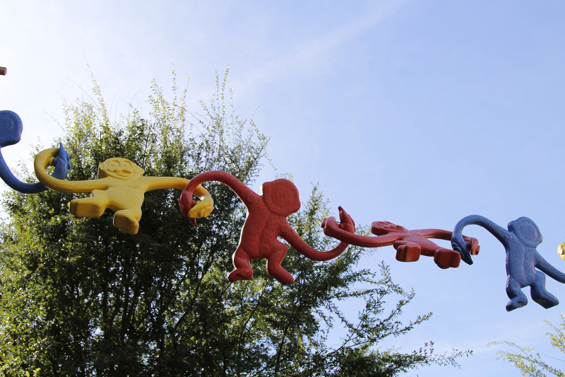 Toy Story comes to life with themed architecture throughout Pixar Place
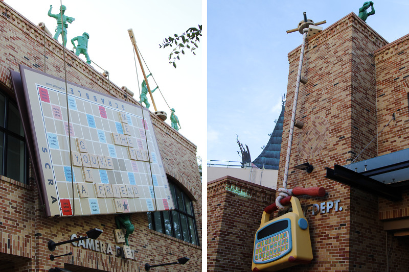 Toy Story comes to life through intricate detailing reminiscent of your favourite movie scenes
Enter the ride and it only gets better – you’re instantly immersed in Andy’s room where queues are fenced with building blocks, crayons, dominos and cards. Snakes and Ladders boards adorn the floor and games of Twister, an Etch A Sketch and View-Master discs line the walls. The interactive arcade-style ride doesn’t disappoint either! The combined experience is beyond nostalgic, with each ride uncovering things you missed the time before.
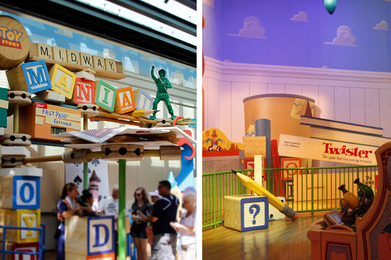 Every where you turn, you're bound to notice something new
A trip through Epcot is bound to leave you speechless. I was lucky enough to visit during the Epcot International Food & Wine Festival, which took the magic to a whole new level. The World Showcase expands exponentially, gaining some 19 stalls to compliment the 11 full-time ‘countries’ – all dedicated to serving food and drink from each destination. One of the most interesting details about the World Showcase is that the people who work within each stall are from that country, specially employed to add to the park's authenticity and diversity.
The numerous nods to architectural details from all over the world here are carefully executed. Some of the finest work can be seen in the bouquinistes that line the water in ‘France’ as they do the Seine in Paris. Then there's the iconic light fixtures and coloured tiles that bring Piazza San Marco to life within ‘Italy’, or the iconic landscaping that is synonymous with Japan.
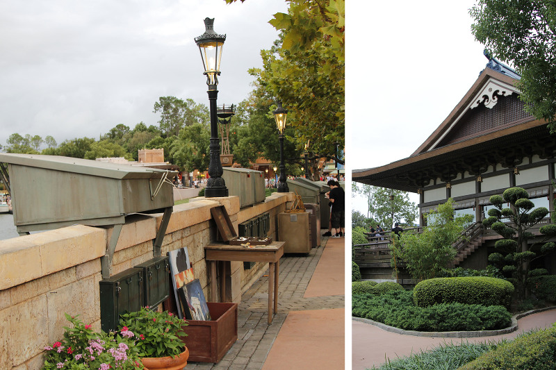 Epcot is designed to transport you to different countries through intricate detailing, such as the Japanese architecture and gardens
The World Showcase is a match made in heaven for keen travellers; hints of nostalgia for places you have visited hit you at every turn. As a designer in the travel industry I’ve seen my fair share of iconic shots, and spotting details that you perceive to be authentic and well-executed is great fun.
An unexpected and lesser-known place that exemplifies this commitment to detail is one of the two water parks onsite, Disney’s Blizzard Beach. With epic storytelling again at play here, the waterpark is said to have been a one-time ski resort, but the snow melted, the slopes were turned to slides and the chalets transformed into beach huts. Little things like the deck-chair ski-lift, the hastily ‘renamed’ stores, and the iceberg obstacle course all add to the instant charm and seriously creative thinking seen throughout the park.
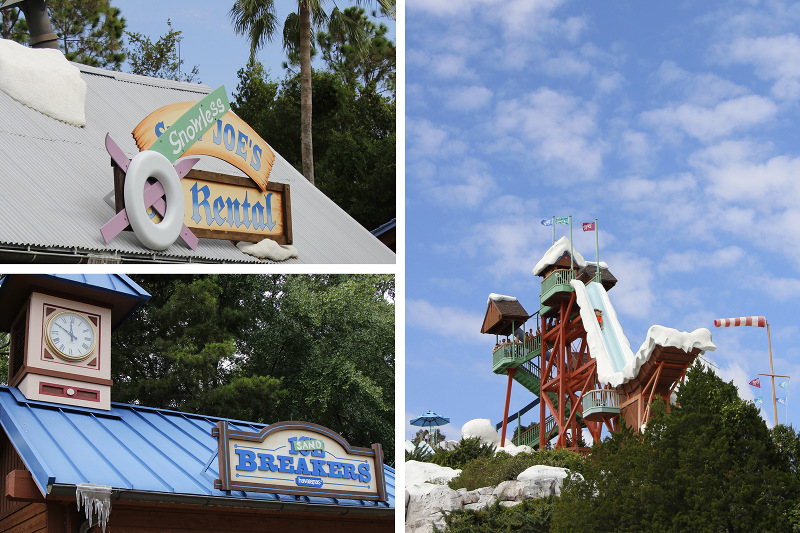 Disney's Blizzard Beach is chalk full of cool references to it's former life as a ski park
 From the alpine architecture to the 'ski-lift' that transports guests over the park, this park screams snow holiday at the beach
 Last, but of course not least, is the wonderful Magic Kingdom Park. With several lands it’s hard to even scratch the surface of the decades of details put into what is undoubtedly the most beloved park of all. The amount of attention put into the Imaginative treatments in order to achieve a sense of grand scale are fascinating. The centrepiece of the park – Cinderella Castle – has bricks that get smaller and smaller as they go up. The Beast's castle, which is home to the ever-popular Be Our Guest Restaurant, is in fact no more than a few metres high, but perched perfectly atop its rocky mountain looks as though it's an impressive structure far in the distance. In Main Street, U.S.A. the buildings are designed to look three stories tall, but with each level smaller than the last they are actually only two.
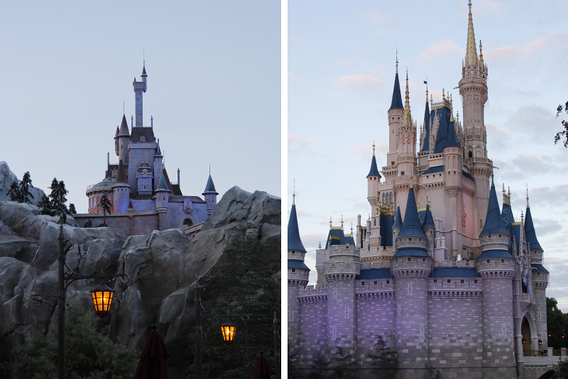 Aside from the obvious details, there are more subtle architectural details designed to trick the eye
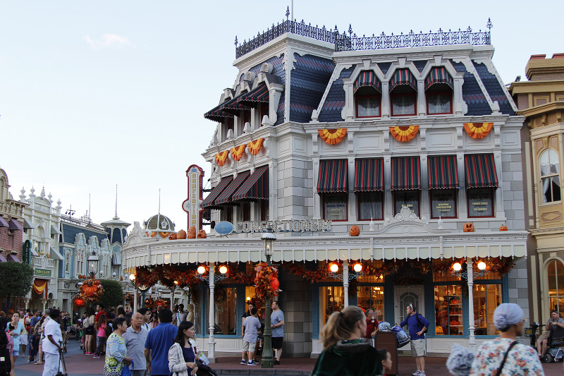 Buildings along Main Street USA are designed to look like three storeys, but are actually two
Perhaps what's most impressive is the imperceptible but definite shift that occurs when leaving one land for another. Without really seeing it, aesthetics change. Plants become futuristic and sculptural in Tomorrowland, or tropical and wild in Adventureland; light fittings go from diving helmet-inspired creations fastened with rope in Ariel's Grotto, to medieval lanterns in Fantasyland. Architecture transforms from quintessential American timber-clad buildings in Liberty Square to wild-west saloon bars in Frontierland.
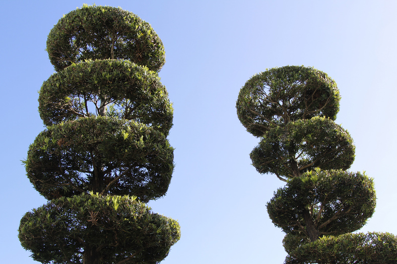 Don't forget to check out the gardens as well, which are also cleverly designed and full of delightful surprises
 Throughout Disneyland, each distinct land is brought to life through intricate details that surprise and delight if you look close enough
It’s hard to summarise the fastidious craftsmanship behind such a huge legacy of work – Disney prides itself on ingenuity and ‘Imagineering’. But if one thing is certain, it is in each and every one of these details that Walt Disney World Resort lives up to the words declared on the park gates. It truly is the place ‘Where Dreams Come True’.
All images: Emma Russell

